If that wasn’t enough, web designers and agencies are currently reeling from another seismic change. This May, Google launched its Page Experience update, which puts a much greater emphasis on user experience when it comes to ranking websites in its listings.
The importance of this should not be underestimated. It means that web designers now need to put much more emphasis on elements like loading speed, interactivity, safe browsing and visual stability…or they’ll quickly see their sites disappear from the first page of Google.
Creative Brand Design, a leading London web design agency, is at the cutting edge of all these developments. So we spoke to them to get their take on the new trends that we can expect to dominate in 2022.
Read on to learn the trends, some examples of them in action, and how to get on board in your web design practice.
1. Fun and optimism
Throughout the 2010s, web and app design was dominated by cooly minimalist, purely functional interfaces. And that made sense at the time. With the iPhone having only appeared in 2007, followed by the first iPad in 2010, most of the public was pretty new to the web. And so making digital services easy to understand, use and navigate was the main priority.
As many creatives pointed out, the side effect was to dampen down the more fun and experimental side of the early web. Now that most people are familiar with digital platforms, there’s arguably space for a return to some of that.
After all, we’ve had nearly two years of a pandemic, and our lives have been disrupted like never before. Surely we’re due a bit of fun?
From the looks of the latest websites, designers agree. We’re currently seeing a lot of visual optimism in website design – bold colours, joyful features, outlandish typography, lots of positive messaging, and enjoyable interactivity. This lighthearted and often unexpected approach is a welcome way to ease us back into “normal” life and take our minds off more serious issues for a moment.
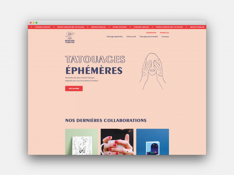
Bernard Forever, demonstrating the Fun and Optimism trend
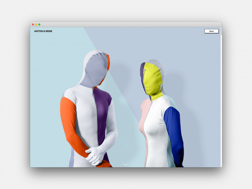
Anton & Irene, demonstrating the Fun and Optimism trend
For a great example of the trend in action, check out the website of temporary tattoo store Bernard Forever. A sense of fun pervades this online experience, from the quirky cartoon character to the subtle animated elements, friendly typography and welcoming colours.
That expressive and joy-inducing approach to colour is pushed further on the online portfolio of designers Anton and Irene. Scrolling through its homepage is an utter joy, as text jumps around and fades in and out, images move to make way, and every piece of information is given lots of lovely room to breathe.
2. Mindful web design
For most people worldwide, lockdown meant your personal world got smaller, simpler, and quieter. And while the web as a whole remains a shouty, busy, stressful place, you can see areas of web design where a sense of restrained calm now has an influence.
We see a move back to clean design with generous use of white space, allowing our eyes and the content to breathe. We call this “mindful web design” – an approach that understands that people don’t want to be overwhelmed with too much information or busy graphics.
Happily, this trend ties in neatly with the requirements of Google’s recent algorithm update, whereby making your website load faster benefits you in the search engine rankings. After all, the simpler your design, the less content there is to load, so it’s a win-win situation.
The trend also dovetails with Google’s demand that sites be mobile-friendly. In a world where people are using a bewildering array of devices, making websites work well on each of them is increasingly challenging. Again, though, the simpler your design is, the easier that task is to achieve in practice.
For a great example of this trend, check out Savoir Design, which creates one-off ceramic pieces. While incorporating all the fun scrolling tricks of the modern web on its site, there’s a controlled sparseness to the layouts here that instantly puts you at your ease.
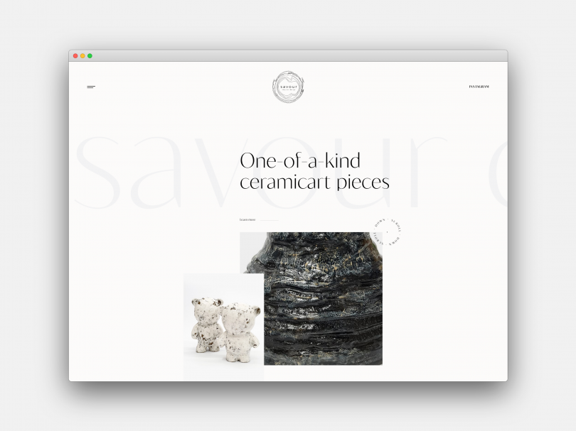
Savoir Design, demonstrating the Mindful trend
There’s a similar abundance of white space on the site of tech writer Elizabeth Befus. You’d expect a former editor-in-chief at Apple to understand minimalism, and her site puts that aesthetic to brilliant and inventive use.
3. Muted earth tones
Lockdown life may have restricted our options, but it also reintroduced many of us to nature. With indoor spaces closed down, we strode out into the great outdoors, whether a hike up a mountain or a stroll around the local park. And this renewed relationship with our environment is influencing contemporary web design too.
Up and down the web, we’re seeing designers choose muted, calm, and earth tones in terms of background colours and illustrations. Giving us something restful to look at, it’s a recognition of just how much we stare at screens these days.
This is a modest approach to design that’s easier to look at and doesn’t strain our eyes too much. If you’re hoping to increase the time visitors stick around on your websites, you could do far worse than follow it.
In some cases, this approach also helps with Google’s new algorithm – again following a less-is-more approach. More fundamentally, it’s a nod to our higher societal awareness of the environment and our impact on the world.
That’s a philosophy that’s right in the wheelhouse of LA digital agency Signature Creative, who create ‘digital products & design for the people of Earth’ and describe themselves as ‘Good people making great things’. Their website combines muted earthy colours with clear and easy-to-read typography and a restrained layout that incorporates calming white space.
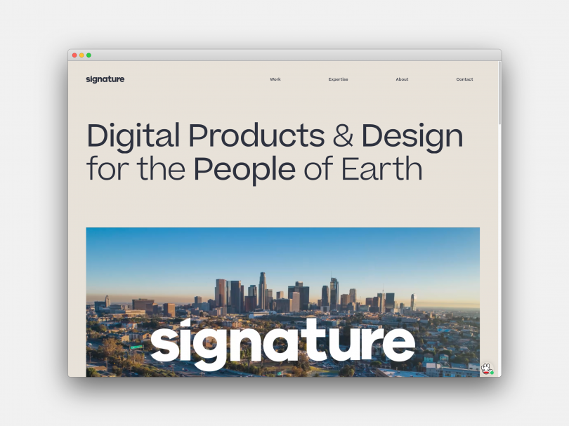
Signature, demonstrating the Muted Earth Tones trend
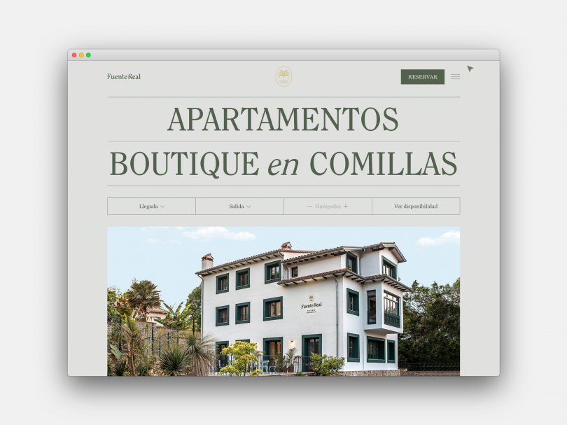
Fuente Real, demonstrating the Muted Earth Tones trend
The trend can also be seen on the website of Fuente Real, a provider of boutique Spanish apartments. The green earth tones used as its main background evoke the kind of tranquil feelings you’d hope to experience when living in one, and the accompanying imagery and logo work well together to enhance the effect.
4. 3D design and multimedia
New technologies have always prompted new web design trends, and the current era is no exception. One big influence right now is how the latest screens provide far more detailed resolution than ever before.
The standard in picture quality has shifted from HD to 4K (four times the pixel density) and upwards. We’re also seeing more and more 4K+ monitors and laptops coming onto the market, and even some 6K and 8K models. We also see higher broadband and mobile data speeds to feed this need for visual detail.
Consequently, we’re seeing many websites move beyond the standard website model of text + a few still images. Instead, web designers are enthusiastically embracing 3D design, animation, AR, VR, and large scale video and imagery, along with interactive features, to make their websites more engaging and entertaining.
That said, all responsible web designers should also be aware of the billion or so people who * don’t* have great connectivity or the latest devices (both abroad and here in the UK). So all such designs need to follow progressive enhancement, delivering the best possible experience to each individual user, depending on what their device is capable of.
For a great example of how websites can harness 3D, take a look at the online portfolio of digital agency Sennep. Its design cleverly combines scrolling effects with 3D images that evoke a fun sense of originality, all in beautiful high-resolution detail.
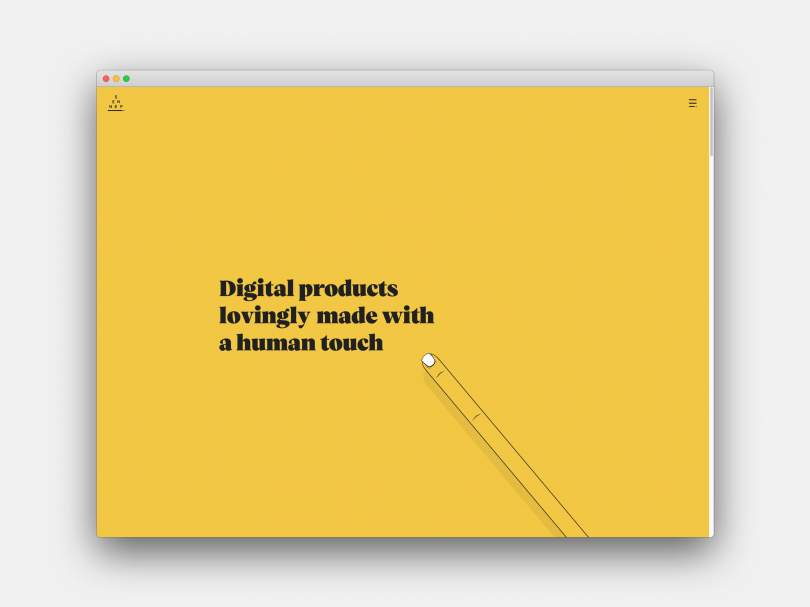
Sennep, demonstrating the 3D Design and Multimedia trend
Another original and crowd-pleasing example of 3D can be seen on the Smart City Map created by internet security company Kaspersky. This interactive map illustrates and introduces new security technologies for various industries, each of which is presented as particular locations. You can move around the virtual city in three dimensions, and it’s a fun way to draw in an audience for what might be seen as quite a dry subject.
5. ScrollyTelling
Social media is often criticised for dumbing down knowledge and ideas, turning them into neat soundbites that do little to engage the brain, and at worst, lead to misinformation and conspiracy theories. That said, elsewhere on the web, it’s easy to find informative, balanced and thoughtful reads. So how do you get people to actually read them?
One web design trend that’s currently growing in popularity is ScrollyTelling, also known as “narrative visualisation”. With this kind of design, as you scroll and read a long-form article, you get fun little visual treats, from elegantly typeset columns to quirky inset images to subtle animations and more.
It’s kind of like reading a printed magazine (in terms of beautiful and inspiring art direction), but with the interactivity of the web and the eye-catching nature of moving images.
The best way to get your head around this trend, of course, is to visit sites and try it out first-hand. A good one to start with is Apple’s official AirPods Pro site, which implements the trend with style and subtlety. Scroll through this minisite, and the hero image moves from darkness to light: it’s a simple effect but devastatingly dramatic.
Scrollytelling is most often used in online journalism. A good example can be found in this HuffPost article on celebrity chef turned humanitarian José Andrés. The first time you scroll through, you think you’re enjoying some highly sophisticated digital trickery. But on closer examination, most of the effect here is achieved through old-school design nouse, particularly the used of angled pull quotes to add visual interest and a sense of dynamism.
Finally, it’s not about vertical scrolling but also horizontal. You can see a great example on this site about Canals of Amsterdam, certainly on desktop. The effect here is very much like an old school picture book, but in an accessible, digital form.
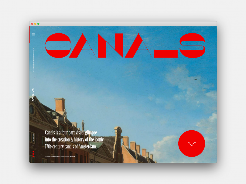
Canals of Amsterdam, demonstrating the ScrollyTelling trend
6. Interactive design pushed to its limits
When it comes to design, what’s the best experience we can offer a user? Some might argue that it’s letting the user choose the design for themselves. That’s why many websites today are taking the concept of interactivity and making it mean more than just moving up and down the page. Instead, entire design features are customisable by the user.
By scrolling and clicking, they can move whole design features around the page, choose background colours and decide when things transform. These are the trends we’re seeing more of right now, and we expect this to continue in 2022.
If you want to give it a try yourself, check out the website of Puppy Love, a creative agency based in New York and Los Angeles. As well as a slick, cutting edge design that’s packed with verve and vivacity, it also gives you the chance to choose your background colour and voiceover: such fun.
Another excellent website taking a similar approach is this educational minisite from Obys Agency, teaching you about the use of grids in design. The website’s design visually demonstrates the principles it’s expounding, and the user is given the choice of having this ‘Grid mode’ on or off, as well as the self-explanatory ‘Crazy mode’.
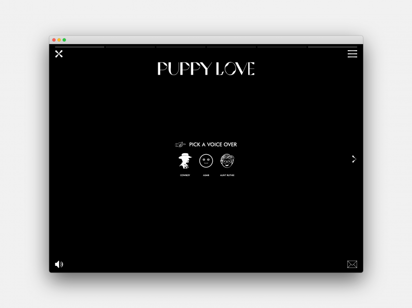
PuppyLove, demonstrating the ‘Interactive design pushed to its limits’ trend
Conclusion
In this article, we’ve introduced you to some of the biggest web design trends affecting the industry right now, which we fully expect to extend their influence in years to come. These stem in part from two big events.
The first is the lockdown and how it’s changed society in ways that are likely to continue long after the pandemic has abated. And the second is Google’s big algorithm change and the firm direction it’s pointing the profession towards, in terms of making websites load more quickly and adapt better to the range of mobile devices available today.
Of course, that’s not the whole story by any means. There’s the ongoing mission to ensure web design is inclusive, so the web is accessible to everyone. There’s the constant launch of new platforms and concepts by the ‘big five tech giants’, such as Facebook’s renewed focus on VR and what’s it’s dubbing ‘the metaverse’. And, of course, there’s the possibility of another big Google algorithm change.
In short, no one can predict the future with any certainty. The only thing we can do is be aware of current trends and what’s behind them and make some educated guesses about what’s to come next. No one ever said web design was predictable, and that’s exactly what makes it an exciting sphere to work in!


